Friday, October 5, 2012

Just Stop It

I was contacted by one of my clients who I had painted a copy of Super Dungeon Explore for. He had acquired a mini from sodapop as a bonus character and wanted to know if I could paint it up. I wanted to, but there was a bit of a snag, I haven't owned any paints or brushes for about three months.

Now I still have plenty of friends who have all their stuff, and I was able to borrow what I needed to complete the job, but it got me to thinking about the fact that I haven't painted for quite some time. 


When GW relaunched their paint line this year, I took a long hard look at where I was and where I wanted to be. I did some basic calculations for replacing all of my paints, along with the investment in a new warhammer fantasy army that I had been planning, and when the cost broke four figures I knew I was done. I got all my paints packed up and traded them to someone who would be able to use them while they were still good. With all the minis painted that I had been planning on, I was able to wrap things up nice and neat.

Except there was a blog that I had been maintaining for the last two years. To say I was attached would be a bit of an understatement.

I had a hard time reaching this decision, but I received some solid advice through this TED Talk. I highly encourage everyone to watch it, it's only 3 and a half minutes, but the relevant point for this post is to focus. If you're going to paint, paint all day every day. If you're going to draw, draw all day every day. If you really want to succeed at one, you can't spend your time worrying about the other, or you won't get either.

This is and always has been a painting blog. Now that I'm not painting, I've decided to take my own advice and just stop it: therefore, this blog will become an archive of the several glorious years of my life I spent painting toy soldiers. I may have one final project on the horizon, but that's still up in the air. If that comes to fruition, I'll post an epilogue, but otherwise, I'm content to leave this blog for others to find, share, and enjoy.

Two final points:

First, don't be afraid to finish. There are 24 hours in a day, and you can't just keep adding new time commitments onto your existing schedule forever. Eventually, as I've found out first hand, you'll run out of room, and then you have to start making sacrifices. That's not a fun road to go down, trust me. Instead, consider the idea that we're constantly starting things, and expected to maintain them, but rarely in our lives are we allowed to finish things. It seems like the internet is especially geared toward this phenomenon of endless effort. There are a million search results on how to start a blog, but precious few on how to end one. Focus on giving yourself permission to examine what you're doing, see if you've accomplished everything you set out to do, and if so, stop doing it. The only way we're going to be able to transition into the next phase of our lives is if we're unencumbered by the past.

Second, I'm still drawing. As a matter of fact, I'm drawing more now than ever. I plan on turning my drawing into something bigger in the future. And I still have plans to do some dreadball illustrations at some point. In the meantime you can find me posting things every weekday:
on twitter
and facebook.

My gratitude goes out to everyone who has been part of this grand adventure for the past two years. Thank you all for making it a journey worth taking.

Now it's time for me to just stop it.

Friday, September 28, 2012

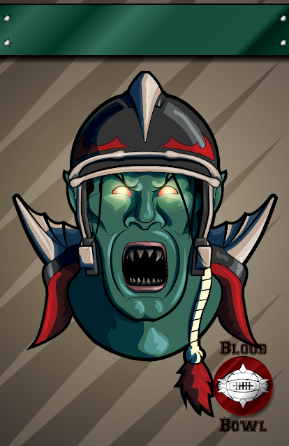
Customizable Blood Bowl Poster: Beastmen

Coming back at you this week with a brand new poster for your Blood Bowl Team. You can download the pdf here, fill in your own team name, and print straight from Adobe Reader. Enjoy!

Beastman Blood Bowl Illustration Poster Games Workshop

Friday, September 21, 2012

Customizable Blood Bowl Poster: Goblins!

Coming back at you this week with a brand new poster for your Blood Bowl Team. As always you can download the pdf here, fill in your own team name, and print straight from Adobe Reader. Enjoy!

Blood Bowl Team Goblin Poster Illustration Games Workshop

Wednesday, September 19, 2012

Dear GW, Stop It

Oh, a storm is coming? Really? Because last time I checked we hadn't even received news that the last storm you said was coming had actually run it's course and cleared up. I know you guys live in England and all, but really, how many storms/dark tides/ominous omens are heading our way? You can only have so much "bad" weather before it becomes commonplace and is just referred to as "weather".

"How's the weather today Bill?" 

"Well, the sky is the color of fire, it's raining acid, and there's giant mechanical aberrations everywhere. You know, the usual."


Stop it. 

And it's getting dangerously close to 2013. Photoshopping a static image and having it scroll across the screen isn't exactly a new trick in the playbook. That's some Ken Burns stuff.

I get that motion graphics is a highly specialized technique that is an artform in and of itself. It takes very talented people months of intense work to create even 30 second spots in digital animation, I've actually worked in the field myself. That being said...

Just because you can do something doesn't mean that you should. 

Buying a copy of Adobe Aftereffects doesn't make your Photoshop guy a master animator. He's your Photoshop guy, let him be your Photoshop guy. But who will do the animation you may ask? No one. 

Stop it. 

The new models are cool enough. You've invested so much money and development time into making these staggeringly cool new chaos models, just show us the models! Or how about one of the many, many sketches and concept art pieces I'm sure exist as part of the production of the Chaosy-Mecha-Dragon-Thing? I'm sure those are gorgeous, and speak to the quality of work that has been put into this model.

It just kills me to see this, because I know the product is so good. It's a cheap used-car lot ad for a Bentley Dealership. You already hit the home run guys, just let it speak for itself.

Just stop it.

Friday, September 14, 2012

Originality, Practice, and a new Chaos Poster

Most weeks when I sit down to start a new piece, I'm expecting an evolution of skill. From project to project, the difference in craftsmanship isn't very pronounced. While a better concept will ultimately result in a better execution, I "know" roughly how good a piece will look well before I've finished. It's one of the big barriers of extended practice, not being able to see yourself dramatically improve every time you do a new piece. Except for that every once in a while, something weird happens. 

Blood Bowl Poster Chaos Games Workshop

You can download the new poster here.

Those of you who have been following my work for a while will recognize instantly how much better this is than anything that has preceded it. This is one of those very rare moments, not of evolution, but revolution. This is a game changer, and inevitably will become the new standard by which all my other work will be judged.

So what gives? How did I make such a dramatic change in just 1 week?


You don't always have to be original


In a speech I listened to long ago, an industrial designer was trying to tell us something important. It would be several years before I finally understood his message. He said, quite simply, that most of the problems had been solved, and it wasn't my responsibility to try and re-solve them. 

"Of course it is!" I thought. "If I'm going to be original, I can't build my work on someone else's ideas!"

Bullshit. 

Einstein used an existing system (math) to address his questions of the universe. Picasso painted with materials made by other people, most likely in a mass manufactured setting. Beethoven composed music for the instruments that everyone else had been playing for hundreds of years prior. My point is that even with 95% of their work already done for them, it took the lifetime of massively dedicated individuals to reach the zenith of human achievement. Originality is important, but it must be tempered with moderation. 

They already solved your problems


Enter the DC Comics Guide to Inking. I bought this book on a whim to get free shipping from Amazon. I rightly figured that someone who had been professionally working in illustration longer than I've been alive has a thing or two they could teach me. I got the book about a week ago, and read the first third of the book.

Wow.

I haven't even started in on the rest of it. The information contained in that book is so incredibly useful that I dare not go too fast for fear I'll miss something. But, in that first third, I learned enough about inking to revolutionize my technique. Every single thing I was doing wrong was covered in stunning detail. Not only did the book show me how it was wrong, but why. Most importantly though, it showed me how to fix it.

It was relieving in a way to realize that I'm not very unique and that I am running into the same mistakes as everyone else. Because if I make their mistakes, then I can make their victories as well. Needless to say, after seeing what this book could do for me. I went out and immediately ordered the other four in the series.

Practice

Time for the practice thing again. 

It's not enough to just keep slamming your head against the wall for ten thousand hours and then call yourself the master. This needs to be very deliberate practice with the intent to improve. Ten thousand hours of drawing lousy pictures will only make you really good at drawing lousy pictures. 

I just keep looking at that guy at the top of the post. I still don't believe I did that. But I will. In the meantime, it time to start the next poster sketch, and I can't wait to see what happens this time around...

Friday, September 7, 2012

Customizable Blood Bowl Poster: Wood Elves

Coming back at you this week with a brand new poster for your Blood Bowl Team. As always you can download the pdf here, fill in your own team name, and print straight from Adobe Reader. Enjoy!

Wood Elf Blood Bowl Poster Illustration Games Workshop

Friday, August 31, 2012

Customizable Blood Bowl Poster: Dwarves

Coming back at you this week with a brand new poster for your Blood Bowl Team. As always you can download the pdf here, fill in your own team name, and print straight from Adobe Reader. Enjoy!

Customizable Dwarf Blood Bowl Poster Games Workshop

Friday, August 24, 2012

Customizable Blood Bowl Poster: High Elves

Blood Bowl Poster Games Workshop Elf Elves

Coming back at you this week with a brand new poster for your Blood Bowl Team. As always you can download the pdf here, fill in your own team name, and print straight from Adobe Reader. Enjoy!

Friday, August 17, 2012

Customizable Blood Bowl Poster: Vampire Counts

Vampire Counts Blood Bowl Poster Games Workshop Undead

You may notice something missing from today's Blood Bowl poster: the team name. That's because this week's offering is actually in the form of a fillable pdf that you can download, fill out, and print straight out of Adobe Reader!

In the coming weeks I'll be adding posters for some of the other races and archiving them in one location for people to find, download, and proudly display.


Friday, August 10, 2012

What's in Your Sketchbook?

I talk to a lot of artists. Painters, sculptors, illustrators, graphic designers, hobbyists, you name it. In my opinion it's important to have time for "art talk" if this is what you're really into. And the cool thing is that no matter what it is we're into, we always have the one critical foundation to build the rest of our conversation off: the sketchbook.


But for some reason, when I talk to people who are into painting models and wargaming minis, I find the vast majority aren't keeping a sketchbook. When I ask why, the usual reason I get is something along the lines of not feeling "good enough" to keep a sketchbook or just not seeing the reason.


Lets dispel the myth right now: you ARE good enough to keep a sketchbook. The whole point of the sketchbook is to draw crappy things until they aren't so crappy anymore, then to used that practiced skill to make something beautiful. It's like saying you really want to do archery, but won't try because you're afraid of not hitting the bullseye with the first arrow you loose. They say everyone is filled with amazing drawings, they just need to clear out the 3,000 lousy ones that are gumming up the works.


Furthermore, the sketchbook is where you get to experiment. No one has to see what you're drawing, writing, or thinking about. It's your safe space to get those ideas on paper. Just like drawings, there are lots of good ideas in your head, you just need to get them out in the open so you can then analyze what you really have, and pick out the two or three bits that you actually will be able to use. Got a crazy idea that will never work? Draw it and you might stumble upon a way that it could work, or think or a similar approach that won't be so difficult, or come up with a new idea completely.


Being creative is tough. Everyone's a critic and most people are willing to share their opinions of your work with you whether you want to hear it or not. Most creative people aren't professionals, and don't have the opportunity to develop the thick skin to shield off words of "constructive" criticism. The sketchbook is your testing ground. It's a quick, easy way to visually conceptualize an idea, and get some meaningful feedback before you've sunk 25 hours and part of your soul into the project. It's much easier to reboot an idea you've been working on for 10 minutes.


In summary:
Mechanical pencil + gummy eraser + sketchbook = the most powerful tool in your arsenal, period. 

Do it.

Friday, August 3, 2012

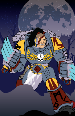
Step by Step: Space Wolf Illustration

One of the real challenges of being an active artist is not falling into habit or taking the easy way out of a situation. It's so easy to just fall back on what you've done a hundred times before and simply repeat it. It's familiar territory, you have the confidence of knowing it's going to work and the risk factor is basically nil. It's a dangerous trap, one that leads to a loss of momentum of growth, which I hope is why everyone out there is pursuing their art. With that in mind, I knew I had to challenge myself with this marine.
Step 1: Space Wolf Illustration

The first thing to go was the helmet. Especially when dealing with a faction like the Space Wolves who are known for fighting without them, helmets are very much one of the easy ways out. A humanoid face is ten times more expressive and equally as difficult to get right. I've never been great at drawing faces, so I use a ton of references. This particular one is half based off an existing GW sculpt and half from the facial expressions seen on Kratos, especially in God of War 3's high definition glory. 

Step 2: Space Wolf Illustration

Once I had the figure done, I started working on the background. I often drop in filler in the form of large chunks of color and texture to help flesh out the weight of the piece, but I wanted to take on the challenge of not only completing the image, but of giving the marine a proper context that added to the story of the image. My dad is constantly pushing me with the question of what the story is that I'm trying to tell with my work, and it's a question worth answering. 

In this case, I wanted the marine ready to launch himself at whatever unfortunate soul had wandered into his vision. Claws up, ready to destroy, the placid snowy scene behind him serves as a stark contrast to the intensity of his armor and stature.

Step 3: Space Wolf Illustration

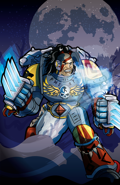
I did my normal round of shading, but gave more time to highlighting, as I really needed the grey armor to stand out against the background. In the past, I had used simple lines to highlight, but this time around I added in full weight to match the shadows. The resulting contrast really helped the definition. 

Step 4: Space Wolf Illustration

I then took the process a step further by adding a secondary layer of highlight and shadow with as much detail as the first. Again, in the past I had done this, but far less detailed and not with original line work. Though more time consuming, the customized results were far more organic and much stronger composition-wise.

Space Wolf Illustration of Grey Hunter Vector Art for Games Workshop

I finished the piece with some soft transparencies, such as the wind, the marine's frozen breath, and the glow of the claws. That last little bit of texture really sealed the deal, and bought everything into focus for me. My lesson from the project:

Take Your Time

I've said it a million times before and I'm going to say it many more as I continue this blog. The only way to improve is to put those hours in. If you've made it this far I can only assume you're related to me (hi mom!) or you have a genuine desire to be the best you can. If you've never heard of Outliers, you can read the synopsis of the book on wikipedia

The super short version: Practice makes perfect, roughly 10,000 hours worth

You read that right. Anyone can run with the big boys, as long as they pay the price of admission. I'll freely admit that I'm just breaking out of the bottom 25%, but I'm throwing everything I have at upping my game, so that one day guys like John Blanche and Raymond Swanland might know who I am. It's a long shot, and I'm going to be very tired at the end of every day, but in honesty, I wouldn't have it any other way. 

Here's to dreams. 

Stay tuned for more drawings next week. 

Friday, July 27, 2012

Work-In-Progress: Space Wolf

I've spent the better part of this week getting the line work together for a new space wolf illustration. There's a ton of detail work in this guy, far more than the last marine I did. 

It's actually kind of ironic that the chapter that is portrayed as the most primitive has the most ornamentation, All the ropes, talismans, runes, pelts; they add up fast. In the end though, I feel like this will result in a superior product. If you're going to do something, do it right. 

From now on though, nothing but Ultramarines.  

Friday, July 20, 2012

Bowling for Blood

I'm amazed at how many incredibly cool Blood Bowl teams there are out there. I got a request from Roy to make a poster for his team as well as the league they played in. Bring on the bowl!


Friday, July 13, 2012

2012 CS Challenge Wrap-Up: Part 2

What a ride.

I started the 2012 CS Challenge to fill the gap left by the completion of my larger-scale painting projects. I had no idea just how clean the slate would get! 

The final CS Challenge models of 2012 are below for your perusal.

Warhammer 40k Dark Eldar Drazhar Master of Blades
Dark Eldar: Drazhar, Master of Blades

Skorne Privateer Press Arch Tyrant Hexeris
Skorne: Hexeris

Warhammer Adventurer Mini Fig
Warhammer: Adventurer

Warhammer Orc War Boss Fantasy Limited Edition
Orcs: Limited Edition Warboss

Dark Elf Sorcerer Warhammer Fantasy
Dark Elves: Sorcerer 

Dark Elf Sorcerer Warhammer Fantasy

I've been getting a truckload of great feedback from users about the illustration projects I've been posting lately, and I'm more than happy to continue them. So from here on in, it's time to let the good times and roll and the ink flow! That Guy James continues onward, still in love with games, still bringing you the best that I can every week. If anyone has any suggestions for new illustrations, just let know. I'll be happy to bring your idea to life.


Friday, July 6, 2012

Concept to Reality: Blood Bowl Poster

Collaboration is one of my favorite parts of art, and when I had a request from one of my readers to help execute an idea he had for a Blood Bowl team poster, I was all-in. Here's a play-by-play of how I took a scanned pen and ink drawing and re-rendered it in Adobe Illustrator.


Casey had sent me this drawing as a sketch of what he wanted to do with the design. Since this was my first time seeing the design, I made a couple notes of what I really liked about the design:

  • The Crooked nose. This bad boy looked like it had been broken and reset a good dozen times. It screams character and attitude. Perfection.
  • The Beard. Stylized to look almost like a set of blades, the facial hair looks just as crazy and dangerous as a Norse football player should be. 
  • The Wings. Naturally.
  • Blood and Thunder. A fitting slogan for this band of ultra-violent miscreants.


Step 1: The Face
I traced out the nose and beard, using the rest of the face as a guide. I actually went beyond the point where I knew the helmet would cover, as this would serve as a guide for when I placed the two together. By developing the head and face separate from the helmet, I didn't have anything to distract me and distort the image. I then gave the entire head a bit of a steeper tilt forward for that extra bit of aggression.

Step 2: The Helmet
I took the basic design from an actual football helmet, changing details as I needed to make it more Blood Bowl-esque. In addition to the wings coming off the ear guards, I pulled the front line back to help expose more of the face, and added a reasonable number of rivets (read: not baneblade level of rivets).

Step 3: Blood and Thunder
I wanted to slogan to be more integral of the illustration itself, so rather than isolate the banner, I had it above and below the face. I took advantage of the two-dimensional effect to tuck the "and" a little further back, letting the eye rest on the "Thunder" at the bottom of the composition. Finally, I cut some small triangles out of the banner at random intervals to give the banner a little more worn feel. 


Step 4: Variety
The current version of Adobe Illustrator has the ability to add variable stroke-widths to your line work. I use this option a lot to add contrast and interest while not overwhelming the smaller details. There are a number of width profiles that come standard that I use often, but I also created several profiles to reuse on my drawings. I also did a thicker solid line around the entire head to help it stand apart from the banner.


Step 5: Color
Not much to add here. Casey specified the color of the helmet should be the same as the Philadelphia Eagles. Done and done.


Step 6: Highlights
This two-step process was accomplished in just one. By tracing out the path I wanted the highlights to follow, I was able to duplicate the layer and set a thinner secondary highlight for extra depth. I made sure to highlight the areas that not only made sense but helped to reinforce the themes I mentioned earlier. The blade-edges of the beard, the curl of the sneering lips, the flow of the banners, they all strengthened the theme.

Fear-Eagles Blood Bowl Poster

Step 7: Shadows and Posterizing
The shadows were a two-step process that couldn't be duplicated to save time, but were worth the effort regardless. The first layer was in the style of Anime cell-shading, using big blocks of slightly darker color. This gave a lot of much needed depth to the wings in particular. 

The second shading was inspired by woodblock cutters like Rockwell Kent. By repeating the black lines in the darkest areas, I was able to not only add depth but to also suggest a flow of surface, something that would not otherwise be apparent in a perfectly flat color like you get from a vector illustration. 

When I was happy with the illustration I dropped it onto a revised Blood Bowl poster template, where I shrank the Blood Bowl logo to give more breathing room to the main character. 

And with that I was done; an incredible experience overall. I learned a ton on this project, about positioning, facial expressions, and perfection versus imperfection in a believable and living character. Many thanks go to Casey for sharing his vision, a true pleasure to work for.

Next week I'm getting some more model together for the rest of the clean slate challenge. Painted goodness inbound!

Friday, June 29, 2012

Step-By-Step: Drawing a Space Marine

I've always been a huge Warhammer 40k fanatic and I think it's important to get back to your roots every now and again. I decided to do a homebrew chapter for Kenton Kilgore's Fighting Tigers of Veda rather than a codex one, though this drawing could fairly easily convert over thanks to the magic of vector. 

Over the course of 11 days I took a piece from concept to completed image, which I've shared below. I included some notes for those who are also interested in drawing marines. I do all my work in Adobe Illustrator CS6. 

Day 1: I sketched out the general pose I was looking for. I knew that I wanted to do a devastator, so I blocked out an area for the gun on his shoulder. More on that later. 

Day 2: I put down some placeholders for the "soft" armor and drew out the gun at the angle I wanted it. I highly recommend grabbing your camera and photographing an actual model for reference. Though I didn't trace the photo, it was a fantastic asset in this task. At this point I noticed the top of the gun didn't really support the "over the shoulder" pose I had originally envisioned, so I had him heft it upright. 

Day 3: Leg and arm plates were added as well as the beginnings of the torso armor. For those wondering where the fuse came from, a friend of mine saw the image on day 2 and claimed it couldn't be a plasma cannon because there was no fuse. I corrected for this on Day 3, we had a good laugh about it, and moved on. 

Day 4: More detail on the legs and torso, and added power cables for the cannon.

Day 5: My old nemesis: hands. In this case I was very fortunate to find a close-up shot of some space marine hands that someone was working on. Again, these images served as invaluable references for the rest of the piece.

Day 6: I added the helmet and armor details, as well as finishing the backpack and throwing on the main logo.

Day 7: Probably the biggest number of changes. I bought the gun down and repositioned the hands. The problem I had with the gun up was that it didn't look right. Even a space marine shouldn't be able to heft a plasma cannon one-handed. Having the gun low and held in both hands gives it a lot of visual weight that it was lacking before. I also resized the shoulder pads and legs, which were undersized relative to the rest of the body to begin with. Finally, I added in line-variations to give it more interest. 

Day 8: Added the signature stripes for the Tigers marine chapter, and swapped the chest icon for a more generic skull-eagle. The tribal wing design goes well with the tiger stripes, unifying the armor. I also added some Bengali script for the word "fire".

Day 9: Color and shadow, reintroducing the logo in the background.

Day 10: Glow effects for the plasma cannon and eyes.

Day 11: I wrapped things up with a round of highlights, darkening the armor to make it less of a charcoal color. I added in black-line shading for the metallic areas for extra contrast, and set the marine against a colored background for contrast.
All in all a fun little project with a great outcome. Next week we'll be doing another step-by-step, but this time for blood bowl!

Sunday, June 24, 2012

Blood Bowl League Poster

Mercutioh stopped by last week and asked for a poster for his local Blood Bowl League. I couldn't think of any reason not to, so here it is!

Blood Bowl League Poster

I'm loving the Blood Bowl Stuff. 

Friday, June 22, 2012

2012 CS Challenge Wrap-Up: Part 1

As I'm working on all the new illustration projects, some secret some not, I realized I never posted the remaining models from my collection that I had painted as part of the 2012 CS Challenge. Over the next few weeks I'll be posting these models (in no particular order). Enjoy!

Imperial Guard: Vostroyan Sniper Warhammer 40k
Imperial Guard: Vostroyan Sniper

Imperial Guard: Vostroyan Sniper Warhammer 40k

Imperial Guard: Vostroyan Sniper Cadia Warhammer 40k
Imperial Guard: Cadian Style Vostroyan Sniper

Lords of the Rings: Denethor Painted Miniature
Lords of the Rings: Denethor

Lords of the Rings: Denethor Painted Miniature

Ork Mek Boy Warhammer 40k
Orks: Mek Boy

Ork Runt Herd Warhammer 40k Squig
Orks: Runt Herd 

Ork Runt Herd Warhammer 40k Squig