I was immediately intrigued.
It's one thing to submit your work into a pool of entries. If you do poorly there's no real sense of personal loss, you merely are ranked among those who did not win, which if the competition is large enough, puts you in good company. But to be compared directly to another single entry with the threat of removal should you fail; that's a very intense situation to me. It waxes of the kind of scenario that can bring out the very best, and possibly the very worst, in people. Needless to say, I was in.
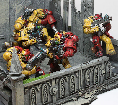
The theme of the first round was to create a troop squad of at least minimum squad size from any major gaming system. My mind whirled with possibilities, but in the end, I settled on my old standby's: the Space Marines. Space Marines are just classic, instantly recognizable to the wargaming community, with plenty of options to really expand them into new territory, the perfect balance of old and new. For my chapter I wanted that same balance, a canon chapter that hadn't been done to death by a thousand other players. I settled on the Howling Griffons, drawing on the strong visual combination of red and gold to make my guys stand out.
One thing I learned very early in my days of competitive painting was that craftsmanship was not everything. I lost a competition against another player who hadn't spent nearly as much time painting or customizing the individual units in his army.
So why did he win?
His army was unique.
If you want to get a judge's attention in painting, you have to have a hook, a visual difference that immediately sucks the viewer in and makes them want to know more. A good friend of mine plays a space marine army that is painted with tiger stripes. They aren't the end-all be-all of craftsmanship, as a matter of fact my armies wipe the floor with his in that department. But when we played a game in a store, everyone came up to him, complimenting him on the look of his army, saying nothing to me. I don't begrudge him for this at all, as it only served to reinforce this very important lesson.
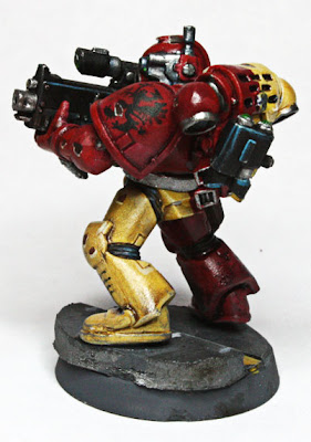
With that in mind, I really wanted to make these guys stand out, to ensure that not only were they very appealing, but the left a strong impression on the viewer. For this, I decided to take the otherwise immaculate looking space marines and plunge them right into the dirty, rubble-strew streets of an urban clash.
The Action
The first concept, and perhaps the simplest to grasp and execute, is the action. Not everyone has to be posed like they're shooting their gun / swinging their sword all the time. Watch a good war flick like Blackhawk Down. There's lots of shooting but there's lots of other stuff going on. Sometimes the soldier has to take cover, sometimes he has to throw a live grenade out of the way, sometimes he has to *gasp* reload!
Showing something out of the ordinary, but reasonable for the model in question, is a great way to draw the viewer in. Especially for the jaded hobbyist who has seen a million "about to chop your face off" poses, it's an instant highlight to see the two seconds when the action has cooled down just a bit for the marine to hammer in a fresh clip before the beatings resume. This can work for any race in any game: a medieval soldier wiping blood from the side of his mouth, a futuristic biker making an adjustment to a critical lever, an orc picking his nose, all of these would make a great point of interest.
The Pose
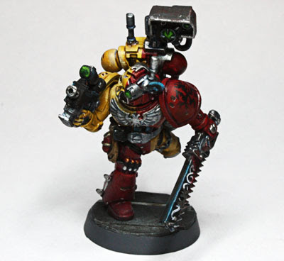
Sometimes the pose of a model is everything. The suggestion of an intense action, leaving the rest of the movement up to the viewer, is a great way to again invite that interactivity; to begin to build this fictional world inside their head; to encourage the buy-in. And it isn't impossible to achieve. This model was reposed with a single cut at his left wrist to allow the hand to go straight. Again, movies play a huge roll in figuring out exactly how you want something to look. You can mess around with the idea in your head for hours, or you can turn on Commando and hit the pause button (okay, not Commando, but you get the idea.)
The Narrative
One of the big reasons for all this extra detail is to reach a point where you're transcending the idea of a single image. If I paint a model of a guy holding a gun and looking at something, then I've given the viewer almost nothing to work with. But if his back is to the wall, and he's peering around the corner, now there's a real moment. And the best part is that the one moment tells of all the moments before it, and hints at the ones to come.
IF you can pull this off, then you're moving into a territory where a single dynamic model has the same effect as a dozen static ones. And why waste your time painting a dozen static models when you can save money, time, and space?
The Base
Up until now I haven't had many kind words for the old standby: marine with gun model. Here are my kind words: at least one is absolutely necessary in order to make the scene/project work. It may sound counter intuitive, but consider that the viewer need a point of reference for the rest of the piece. If everyone is doing gymnastics and all these incredibly detailed actions, no one is going to know how much that means until you show them at least once what they could have been getting. Who better to appreciate an a well prepared meal than the person who has been eating nothing but white bread and water?
And don't forget, grizzled veterans are never your sole audience. You need something for the newcomer, something to let them know that what they're looking at is really special. A perfect example is the new Space Wolf Pack box that GW released last year. It chalk full of amazing bitz, but the squads that get nothing but those bitz just crammed onto every available spot look overdone and the individual items lose their interest. But spread out over several units, suddenly everything takes on a very strong and dynamic life of it's own. You need the rain to appreciate the sun, the dark to appreciate the light; always bring a tasteful frame of reference to let them know just how hard you've been working.
The Details
I'm sure you've noticed by this point that these guys look like they've been through one hell of a fight. The intense weathering and chipping on the armor really brings it all home. It also humanizes the conflict; they may be the greatest humans of all time, but they are still human. They take shots just like the rest of us, they're just too tough and well armored for it to matter much. Again harking back to that frame of reference, it really speaks to a much tougher and durable warrior who is still standing even after obvious signs of physical damage (base). He's seen some action (narrative), but he's still going strong (pose). This is a fight to death, and he'll do anything it takes to survive (action).
So those are some of the general ideas behind a highly customized project. I highly recommend entering painting contests anytime you can. You may win, you may lose, but you'll never work harder. Because it's only when we're pushed outside of our comfort zones that we become capable of something truly remarkable.


