Oh, a storm is coming? Really? Because last time I checked we hadn't even received news that the last storm you said was coming had actually run it's course and cleared up. I know you guys live in England and all, but really, how many storms/dark tides/ominous omens are heading our way? You can only have so much "bad" weather before it becomes commonplace and is just referred to as "weather".
"How's the weather today Bill?"
"Well, the sky is the color of fire, it's raining acid, and there's giant mechanical aberrations everywhere. You know, the usual."
Stop it.
And it's getting dangerously close to 2013. Photoshopping a static image and having it scroll across the screen isn't exactly a new trick in the playbook. That's some Ken Burns stuff.
I get that motion graphics is a highly specialized technique that is an artform in and of itself. It takes very talented people months of intense work to create even 30 second spots in digital animation, I've actually worked in the field myself. That being said...
Just because you can do something doesn't mean that you should.
Buying a copy of Adobe Aftereffects doesn't make your Photoshop guy a master animator. He's your Photoshop guy, let him be your Photoshop guy. But who will do the animation you may ask? No one.
Stop it.
The new models are cool enough. You've invested so much money and development time into making these staggeringly cool new chaos models, just show us the models! Or how about one of the many, many sketches and concept art pieces I'm sure exist as part of the production of the Chaosy-Mecha-Dragon-Thing? I'm sure those are gorgeous, and speak to the quality of work that has been put into this model.
It just kills me to see this, because I know the product is so good. It's a cheap used-car lot ad for a Bentley Dealership. You already hit the home run guys, just let it speak for itself.
Just stop it.
Showing posts with label Warhammer 40k. Show all posts
Showing posts with label Warhammer 40k. Show all posts
Wednesday, September 19, 2012
Friday, August 3, 2012
Step by Step: Space Wolf Illustration
One of the real challenges of being an active artist is not falling into habit or taking the easy way out of a situation. It's so easy to just fall back on what you've done a hundred times before and simply repeat it. It's familiar territory, you have the confidence of knowing it's going to work and the risk factor is basically nil. It's a dangerous trap, one that leads to a loss of momentum of growth, which I hope is why everyone out there is pursuing their art. With that in mind, I knew I had to challenge myself with this marine.

The first thing to go was the helmet. Especially when dealing with a faction like the Space Wolves who are known for fighting without them, helmets are very much one of the easy ways out. A humanoid face is ten times more expressive and equally as difficult to get right. I've never been great at drawing faces, so I use a ton of references. This particular one is half based off an existing GW sculpt and half from the facial expressions seen on Kratos, especially in God of War 3's high definition glory.

Once I had the figure done, I started working on the background. I often drop in filler in the form of large chunks of color and texture to help flesh out the weight of the piece, but I wanted to take on the challenge of not only completing the image, but of giving the marine a proper context that added to the story of the image. My dad is constantly pushing me with the question of what the story is that I'm trying to tell with my work, and it's a question worth answering.
In this case, I wanted the marine ready to launch himself at whatever unfortunate soul had wandered into his vision. Claws up, ready to destroy, the placid snowy scene behind him serves as a stark contrast to the intensity of his armor and stature.

I did my normal round of shading, but gave more time to highlighting, as I really needed the grey armor to stand out against the background. In the past, I had used simple lines to highlight, but this time around I added in full weight to match the shadows. The resulting contrast really helped the definition.

I then took the process a step further by adding a secondary layer of highlight and shadow with as much detail as the first. Again, in the past I had done this, but far less detailed and not with original line work. Though more time consuming, the customized results were far more organic and much stronger composition-wise.

I finished the piece with some soft transparencies, such as the wind, the marine's frozen breath, and the glow of the claws. That last little bit of texture really sealed the deal, and bought everything into focus for me. My lesson from the project:
Take Your Time
I've said it a million times before and I'm going to say it many more as I continue this blog. The only way to improve is to put those hours in. If you've made it this far I can only assume you're related to me (hi mom!) or you have a genuine desire to be the best you can. If you've never heard of Outliers, you can read the synopsis of the book on wikipedia.
The super short version: Practice makes perfect, roughly 10,000 hours worth.
You read that right. Anyone can run with the big boys, as long as they pay the price of admission. I'll freely admit that I'm just breaking out of the bottom 25%, but I'm throwing everything I have at upping my game, so that one day guys like John Blanche and Raymond Swanland might know who I am. It's a long shot, and I'm going to be very tired at the end of every day, but in honesty, I wouldn't have it any other way.
Here's to dreams.
Stay tuned for more drawings next week.

Friday, July 27, 2012
Work-In-Progress: Space Wolf
I've spent the better part of this week getting the line work together for a new space wolf illustration. There's a ton of detail work in this guy, far more than the last marine I did.
It's actually kind of ironic that the chapter that is portrayed as the most primitive has the most ornamentation, All the ropes, talismans, runes, pelts; they add up fast. In the end though, I feel like this will result in a superior product. If you're going to do something, do it right.
From now on though, nothing but Ultramarines.

Friday, June 22, 2012
2012 CS Challenge Wrap-Up: Part 1
As I'm working on all the new illustration projects, some secret some not, I realized I never posted the remaining models from my collection that I had painted as part of the 2012 CS Challenge. Over the next few weeks I'll be posting these models (in no particular order). Enjoy!


 |
| Imperial Guard: Vostroyan Sniper |

 |
| Imperial Guard: Cadian Style Vostroyan Sniper |
 |
| Lords of the Rings: Denethor |

 |
| Orks: Mek Boy |
 |
| Orks: Runt Herd |

Saturday, June 2, 2012
James Draw: United
Every week I bring you a new illustrated piece inspired by some of my favorite games. This week we've got a propaganda piece for the Tau Empire from Warhammer 40k.

Sunday, April 8, 2012
Crimson Fist Icon
One of my readers was saying that he was considering working on a Crimson Fist logo for an upcoming project. This immediately made me think of an illustration I had done a while back but never posted on this blog. So enjoy the day and enjoy your icon reference.

Friday, April 6, 2012
Tutorial: Oversized freehand designs
About a month ago, I had a request to do a tutorial on large-scale freehand designs, and here it is!


I started out with a Chaos Space Marine Rhino painted by my good friend Brian Coe. He is the proud owner of a chaos force that currently has thousands of points worth of models from every conceivable aspect of the army. To get all those marines around the board he has many APC's that have recieved a basic paint job. He was generous enough to donate one of his vehicles for the purpose of today's tutorial.

I chose the chaos star due to it's complexity, and to illustrate how to break that complexity down to a manageable level. When you're getting ready to lay out a large design, there are a few key points to bear in mind.
1- Break it down.
Even something as intimidating as the chaos star design is actually nothing more than a circle with a buch of rectangles poking out at 45 degree intervals. At the end of the short sides of the rectangles is a triangle, with a wider triangle on the outside of the circle. This works for any logo or icon you may want to use.
If you're having trouble, trying printing out a black and white version of the logo and put some tracing paper over it. With some practice, you'll soon be able to spot the combination of basic shapes that make the more complex designs.

2- Map out reference points
One of the major pitfalls when working with a large design like this is that it's very easy to get caught up in the details. This is fine, you want those details to look good after all, if you think ahead you can save yourself time and torture of having to redo a section. Before I even started the outlining process, I carefully placed reference points for all eight tips. That way, when I was distracted by other elements, I knew that the points would still line up.

3- Take your time
I can't count the number of times I've been to a tournament and seen armies that hurt just to look at. It's not because they were bad, in fact, most of the "guilty" armies I saw were quite good.
But they weren't great.
This had nothing to do with the skill of the painter, the price tag of the brushes, the type of paint, or the manufacturer of the models. 99 times out of 100 its because he didn't take his time to push the model just that last painful step into something really special. I know it sucks and I know all too well the desire to just be done.
Just think of it this way, an hour may be the only difference between goodness and greatness. That's not even a single game of 40k, and you'll have many such games to enjoy the results of your effort. Be strong, be patient, use the force, whatever you have to do, and you'll be unstoppable.
Thursday, March 1, 2012
The Archives: Baal Predator
I painted this Blood Angel Baal in 2010 for a competition on BoLS. I didn't win but I had a blast working on it.

Friday, February 24, 2012
Salamander
This model is being painted for the 2012 Clean-Slate Challenge, an attempt to paint all the forgotten models accrued over the years by an enthusiastic hobbyist.
This sternguard veteran is the last of a broken family. Of the initial box of 5, one became an Ultramarine, a Space Wolf, 2 Black Templars, and now finally a Salamander. I admit when I got this box I wasn't even thinking of how I could use these guys, only that they were shiny and new. Now, 3 years later, we finally put this box to bed.
Space marines present me with an interesting challenge, mainly due to the fact that I've painted entirely too many of them. It's a real effort just to find something I haven't done yet. I've painted four complete space marine armies, as well as dozens of the emperor's finest for other people's chapters, roughly 500 in total. But for as many variants as I have painted, there are still many canonical chapters that I have not. So I cracked open my 5th edition codex and flipped to the first chapter to grab my attention: the Salamanders.

Micro-Lesson: Green
Ever since foundation paints came out, I've used them in virtually every project; they're just too good to pass up. The range of colors that GW offers is prolific, but there are a few notable exceptions. While the 3 greens that foundation offers can cover a large range of natural subdued tones, getting that rich vibrant green can be a tricky proposition.

Here we have our marine with a watered-down coat of Knarloc Green over a white primer base. Interestingly, you can see where the water pooled it separated the pigments, showing just how much blue is sitting in this color.
Watering down is the key here. You want a fairly even tone throughout the model, but you don't want to go overboard. You'll avoid the thicker foundation paint building up, and keep the tone brighter. Snot Green streaks like crazy over pure white, and loses it's saturation over the Knarloc. Once you've gotten the consistency you want, you're free to work in some shading.
Looking to the above pic with the blue remnants, you'll find that we've actually been given a clue as to how to shade this model properly. In a previous post I had talked about using colors besides black and the base color to create more interesting shadows. The same rule applies here. I worked blue into all the shaded areas and even bought it into the highlighting for the black armor (more about that here). Since the Salamanders only have two major colors (green and gold), I was able to introduce blue without making things look busy.
A good rule of thumb for miniature painting is to try and keep the major colors at or below 3. Shades and tints don't count, and neither does black or white. Some models will have extra gadgets that require a new color, but for the purposes of this rule we're only talking about a surface area that accounts for more than 20% of the total model.

I also took the opportunity to go to town with some custom freehand work. A word to the wise: if you're going to work on the underside of anything, do yourself a favor and get the work done before you glue it together. You'll save time and stress, trust me on this one.

Well, that's enough of this far-future nonsense. Next week we're kicking it old school with shiny knights and high-flying banners!
Thursday, February 23, 2012
The Archives: Black Templar Venerable Dreadnought
I painted this guy in 2008 before I even considered playing a Black Templar army. A friend of mine got a Templar Venerable Dreadnought mis-shipped from forgeworld and had no use for it. I quickly snatched it up, and (several toothbrushes worth of scrubbing later) I was in business.

Friday, February 17, 2012
Servo Skull
This model is being painted for the 2012 Clean-Slate Challenge, an attempt to paint all the forgotten models accrued over the years by an enthusiastic hobbyist.
This one is a real mystery to me; I just can't remember where I got this guy from. I flipped past this model so many times in my bits box wondering what I would ever use it for. I always assumed it would be a secondary element to a larger model, floating next to a techpriest, inquisitor, etc. But in typical fashion, a much more interesting idea was spawned from a conversation with a very good friend of mine.
I mean really, even the greasy spoon has to advertise in the 41st millennium somehow, right?


This one is a real mystery to me; I just can't remember where I got this guy from. I flipped past this model so many times in my bits box wondering what I would ever use it for. I always assumed it would be a secondary element to a larger model, floating next to a techpriest, inquisitor, etc. But in typical fashion, a much more interesting idea was spawned from a conversation with a very good friend of mine.
I mean really, even the greasy spoon has to advertise in the 41st millennium somehow, right?
Micro-Lesson: Source Lighting
A lot of people will tout this technique as a indicator of a higher level of skill. Don't buy into the hype. This is an easy step you can take with any model that adds to the result without requiring hours of your time or an MFA. The first step is to get your model painted up like you would normally. We're going to built this effect layer by layer.
Layer 1: Ambiance
When you've gotten all the basic colors down, your first choice is about the environmental or ambient light. Subtle shadows will push the highlights back resulting in a more balanced look to the model. Here I pushed the shadows way back to illustrate how far you can take this technique. The other consideration is color of the ambient light. Think about the world that you're putting this little guy in. In this example I wanted him to be on a lonely cold street well after dark, so I added a ton of blue to the shadows.
In practice, what you'll be doing is washing/dry brushing (your choice) with the colors you've established. Here I was drybrushing successively darker layers of a mix of Chaos Black and Necron Abyss. I also gave the underside of all the surfaces a wash of Asurman Blue.
Layer 2: Shadow
This is where you really push the dark parts back, all the way to pure black if you want to. The key to a good shadow is knowing where the light is coming from so you paint only where it isn't hitting. In this case the light source is a obvious one, which makes it simple to see where the light would and would not hit.
The execution of this layer is the same as the previous one, you'll just be doing heavier coats with more repetition. It's always good to go less subtle on a given pass of the brush. You can always add more pigment, but taking it away is nearly impossible without some amount of destruction.
Layer 3: Light
Here's where it all comes together. With successively brighter pigments, work your way closer to the light source. Every time you switch to a brighter pigment for a new pass, try to cover a smaller area inside the one you just completed. You will create some nice gradients that get brighter as they approach the source.
Like any technique, this requires practice, but if you keep it broken into these three steps, you'll have it down in no time.
And don't forget to Eat at Joe's. Every Thursday they have Hamburger and Egg for a nickel.
Friday, February 10, 2012
Imperial Guard
These models are being painted for the 2012 Clean-Slate Challenge, an attempt to paint all the forgotten models accrued over the years by an enthusiastic hobbyist.
I remember being in my BLGS (Belligerent Local Game Store) and seeing the box of 5 troopers, thinking to myself that I should really get it. I must have had a good use for the box, as I only have 2 of the original 5 models left. What happened to the other 3 is a complete mystery. If anyone reading this has any clue as to where those models ended up, I'd be fascinated to hear how and when they made their way to you from me.
Cadia is an all-time favorite of mine from the Warhammer 40k universe. I've always been intrigued by the idea of a group of regular every-day men being trained to fight off the horrors of the universe with little more than rigid discipline and a reliable if slightly underpowered firearm.

I knew the first model had to be a traditional Cadian Shocktrooper. If I had the time I would paint a million of these guys. I love the simple aesthetic of this model and how well it translates into the game. It's clean, well stated, and direct; a noteworthy contrast to the overly verbose space marines.
Micro-Lesson: Khaki with depth.
Beige is a deceptively tough color to get just right. Yes, you can throw down a coat of Dheneb Stone, wash it with Devlan Mud and call it day; I understand IG players have a ton of dudes to get painted up. At least consider this tutorial for your Junior Officers and above.
The idea when adding depth to this color is to do it in stages. It also helps to do this before you paint any other part of the model, so you don't have to worry about messing up another color. This model starts with Dheneb Stone, and all the steps will be a 1:1 ratio of wash to water. Remember: baby steps.
- Ogryn Flesh: whole model
- Devlan Mud: undersides/shadowed areas
- 1:1 Mix of Devlan Mud and Thraka Green: where the uniform meets plate armor
- Badab Black: Darkest areas
- Highlight the top level areas with Dheneb Stone
With a little practice, this technique will give you nice smooth transitions in your cloth.

I had my basic Cadian done, and I wanted to really push the weathering / battle damage with the second.

This was essentially the same paint style, except when I was done I took it a step further by adding the wear-and-tear. I really enjoy this paint style personally, but it isn't for everyone. It reminds me of one of my hardest-learned lessons: Just because you can do something doesn't mean you should.
This guy looks great, but so does the first model. Which one should you paint? Whichever makes you happy. Unless you're painting for competition, there's never any tangible difference between techniques, only the value you assign to your own work. You are going to see these models more than any other person on the planet; make sure you like what you see.

Another two models down for the 2012 CS Challenge. Next week, a model that I literally have no idea how I got. It very well may have been put in my bitzbox by gremlins... but hey, a challenge is a challenge!
Friday, January 20, 2012
Sanguinius
I recently had a chance to paint up a Sci-Fi Archangel (aka Sanguinius) from Scibor Monstrous Miniatures.

It's been awhile since I worked with a resin miniature. Each material has it's own quirks and oddities you can work with or against depending on your attitude. For me, resin is a close second to metal in terms of difficulty to work with. The universal problem with resin is air bubbles, which crop up with virtually every figure I've ever seen.
Today's air bubbles reared their ugly heads half way down the sword blade and in the knuckle of the hand gripping the sword itself. The knuckle was an easy fix to fill with greenstuff, but the sword blade was beyond repair. My solution was to cut a notch in the blade to create an interesting design, and mirror it on the other side to make it look intentional. Remember: It's only a mistake if you let it become one.
This is the first time I've worked with a resin piece that didn't come from forgeworld, and I was relieved to find that the notorious film that requires a regimen of scrubbing was not present at all on this mini. I was able to prime the surface without any preparation at all.

What did require some work ahead of time was fitting and drilling the holes for pinning the model. The wings for this sculpt were heavy and bulky. With nothing to hold the wings to the back save for a flat contact point, I knew it would be vital to pin the wings into place. The sword blade by contrast had a minuscule contact point that was also sure to break if the model got any pressure. Finally I drilled a hole in the base of the model to anchor is firmly to the uneven surface of the base.
I glued the pins in place before priming, which would give me the added advantage of having a point I could hold the pieces by without having to worry about ruining the paint job.

The model itself was well detailed, had a dynamic pose, and mirrored the artwork of the Horus Heresy. I did some research to find my subject was clad entirely in golden armor. I'm not a huge fan of single-color armor; you tend to lose details and depth. I focused on pushing the shadows back to the let the landscape of the places come through with the natural shine of the gold paint.

The base that came with the model was outlandish by any standards. It seemed like the sculptor didn't really know what look he wanted to go for, so he just smashed a little bit of everything together into one base. The individual elements that make up the base are highly reminiscent of other Scibor bases styles. I tried to keep the palette neutral with a few minor detail highlights to let the viewer concentrate on the model.
The only real complaint I have about the base is that it forces Sanguinius off center. This isn't a problem in itself, but the massive weight of the wings anchored to his back make the model extremely prone to tipping. I compensated by pushing him further toward the center, but holding the whole piece, you can still feel the lack of true balance.
Overall this is a fantastic figure with lots of great detail, as Scibor is business of making awesome Space Marines. If you're playing a loyalist chapter and want a special model to lead your forces, they have quite the selection of powerarmored badasses to choose from.
Monday, January 2, 2012
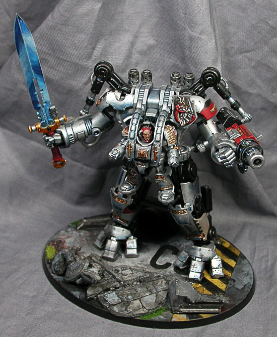
2011: Grey Knights and Blood Angels
I recently got my hands on some miniatures I had painted in early 2011, which gave me a chance to revisit some of the details I missed the first time through. Here's the results:



Friday, December 9, 2011
5 Tips for painting for an existing army
I recently got a notification from the facebook that a good friend of mine was having his birthday: Kenton Kilgore of the Jungle fame. I wished him a happy birthday and asked if he wanted a painted mini, to which he (wisely) responded with a resounding yes, just pick an army and go for it. Kenton has a lot of really cool and unique armies, all filled with characterful minis. I thought to paint a space marine for his gigantic 10k point army, but I thought it might get lost among the masses. I elected instead to paint a mini for his space dwarf army, the Dvergar Steeljacks.

 I ended up going with some of mantic games' excellent Forge Father models. They fit the theme perfectly, as they were space dwarves. As I did my research, I noticed that Kenton had yet to get his hands on any Flash Gits or Lootas. I took advantage of this by selecting the Storm Rage veterans, which came equipped with large and deadly looking guns. The only conversion necessary was to clip away the built-in base that they came on so the pieces would sit on a 28mm Games Workshop base. The extra material underneath their boots actually came in handy, as they put the models at the level created by the rock.

One thing I wanted to avoid was having the black armor simply be black with a glaze over it. That being said, I didn't want to violate my first rule by not having the reflective armor. I comprimised by undercoating the models with several layers of increasingly lighter shades of blue before completing the look with a layer of pure black, leaving the armor with gradient highlighting on the edges.

All in all this project took me two days. The largest chunk of time was spent waiting for the pieces to arrive from England, but once they were here I was off. I knew it would be a belated birthday present the second I made the offer, so I didn't want to make it any longer than it already was.


Tip 1: Research
It's important to know what elements of the army you're trying to emulate and what key points shouldn't be messed with. You want it to be your own, but ultimately it needs to fit alongside it's brethren.
I spent some time looking at pictures of the existing models, and reading the commentary on where Kenton had pulled his inspiration from. Several things I noted:
- Heavy use of metallics
- Gold stripe down the center of the helmet
- Based on the Pittsburgh Steelers color scheme
- Highly reflective black armor
Tip 2: Select the Right Model(s)
When it comes time to select the models, be sure to find something that fits your budget not only in terms of money but time as well. If you're dedicating the resources to supplement someone else's army, make sure you can do it in a reasonable time.
Tip 3: Be Original
Part of the gift is what you can bring as a personal interpretation to the existing theme. With the core rules of the aesthetic in mind, do something that you want to do. Have fun with it, and you'll end up with a superior experience and a superior product.
One thing I wanted to avoid was having the black armor simply be black with a glaze over it. That being said, I didn't want to violate my first rule by not having the reflective armor. I comprimised by undercoating the models with several layers of increasingly lighter shades of blue before completing the look with a layer of pure black, leaving the armor with gradient highlighting on the edges.
Tip 4: Get It Done
No one likes having an offer revoked or even worse, simply unfulfilled. Even a 'free' offer should be treated just like the person was a paying client. It will avoid procrastination, keep your paying jobs on schedule, maintain a good working mindset, and generally enhance the effect of your initial generosity. Anyone can make a promise; be one of those rare people who keep them.All in all this project took me two days. The largest chunk of time was spent waiting for the pieces to arrive from England, but once they were here I was off. I knew it would be a belated birthday present the second I made the offer, so I didn't want to make it any longer than it already was.
Tip 5: Document
Just because you painted the model for someone else doesn't mean you don't deserve credit for it. Avoid the temptation to ship the model out the second you complete it and make sure you've photographed EVERYTHING you want to. It's probably the last time you're going to see that model in your studio, make it count.It was a great experience and great fun to paint something for someone like Kenton who gives so much of himself to the community. I encourage everyone to undertake a project like this every now and again. It's a good way to stretch yourself creatively, build networks, and celebrate all the wonderful individuals that make up our community.
Monday, October 17, 2011
Ork Nob
Coolminiornot was running a contest for a single painted ork/marine/chaos marine, and I wanted to give it a shot. Here's the results.


It's easily the best mini I've painted thus far, but it couldn't hold a torch to the masterpieces that are commonplace on that site. It's a little disheartening to have your work blown out of the water, but I don't paint for glory. Painting for competition is a different beast, and one I'm happy to leave be most of the time. Still, at least my friend got a nice Ork out of the deal.


Subscribe to:
Posts (Atom)