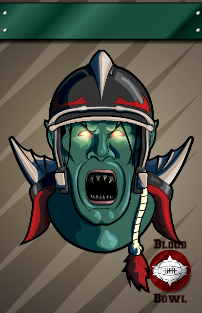
Coming back at you this week with a brand new poster for your Blood Bowl Team. As always you can download the pdf here, fill in your own team name, and print straight from Adobe Reader. Enjoy!
Friday, August 31, 2012
Friday, August 24, 2012
Customizable Blood Bowl Poster: High Elves
Coming back at you this week with a brand new poster for your Blood Bowl Team. As always you can download the pdf here, fill in your own team name, and print straight from Adobe Reader. Enjoy!
Friday, August 17, 2012
Customizable Blood Bowl Poster: Vampire Counts
You may notice something missing from today's Blood Bowl poster: the team name. That's because this week's offering is actually in the form of a fillable pdf that you can download, fill out, and print straight out of Adobe Reader!
In the coming weeks I'll be adding posters for some of the other races and archiving them in one location for people to find, download, and proudly display.
Friday, August 10, 2012
What's in Your Sketchbook?
I talk to a lot of artists. Painters, sculptors, illustrators, graphic designers, hobbyists, you name it. In my opinion it's important to have time for "art talk" if this is what you're really into. And the cool thing is that no matter what it is we're into, we always have the one critical foundation to build the rest of our conversation off: the sketchbook.
But for some reason, when I talk to people who are into painting models and wargaming minis, I find the vast majority aren't keeping a sketchbook. When I ask why, the usual reason I get is something along the lines of not feeling "good enough" to keep a sketchbook or just not seeing the reason.
Lets dispel the myth right now: you ARE good enough to keep a sketchbook. The whole point of the sketchbook is to draw crappy things until they aren't so crappy anymore, then to used that practiced skill to make something beautiful. It's like saying you really want to do archery, but won't try because you're afraid of not hitting the bullseye with the first arrow you loose. They say everyone is filled with amazing drawings, they just need to clear out the 3,000 lousy ones that are gumming up the works.
Furthermore, the sketchbook is where you get to experiment. No one has to see what you're drawing, writing, or thinking about. It's your safe space to get those ideas on paper. Just like drawings, there are lots of good ideas in your head, you just need to get them out in the open so you can then analyze what you really have, and pick out the two or three bits that you actually will be able to use. Got a crazy idea that will never work? Draw it and you might stumble upon a way that it could work, or think or a similar approach that won't be so difficult, or come up with a new idea completely.
Being creative is tough. Everyone's a critic and most people are willing to share their opinions of your work with you whether you want to hear it or not. Most creative people aren't professionals, and don't have the opportunity to develop the thick skin to shield off words of "constructive" criticism. The sketchbook is your testing ground. It's a quick, easy way to visually conceptualize an idea, and get some meaningful feedback before you've sunk 25 hours and part of your soul into the project. It's much easier to reboot an idea you've been working on for 10 minutes.
In summary:
Mechanical pencil + gummy eraser + sketchbook = the most powerful tool in your arsenal, period.
Do it.
Labels:
Rant
Friday, August 3, 2012
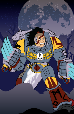
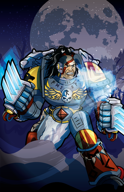
Step by Step: Space Wolf Illustration
One of the real challenges of being an active artist is not falling into habit or taking the easy way out of a situation. It's so easy to just fall back on what you've done a hundred times before and simply repeat it. It's familiar territory, you have the confidence of knowing it's going to work and the risk factor is basically nil. It's a dangerous trap, one that leads to a loss of momentum of growth, which I hope is why everyone out there is pursuing their art. With that in mind, I knew I had to challenge myself with this marine.
The first thing to go was the helmet. Especially when dealing with a faction like the Space Wolves who are known for fighting without them, helmets are very much one of the easy ways out. A humanoid face is ten times more expressive and equally as difficult to get right. I've never been great at drawing faces, so I use a ton of references. This particular one is half based off an existing GW sculpt and half from the facial expressions seen on Kratos, especially in God of War 3's high definition glory.
Once I had the figure done, I started working on the background. I often drop in filler in the form of large chunks of color and texture to help flesh out the weight of the piece, but I wanted to take on the challenge of not only completing the image, but of giving the marine a proper context that added to the story of the image. My dad is constantly pushing me with the question of what the story is that I'm trying to tell with my work, and it's a question worth answering.
In this case, I wanted the marine ready to launch himself at whatever unfortunate soul had wandered into his vision. Claws up, ready to destroy, the placid snowy scene behind him serves as a stark contrast to the intensity of his armor and stature.
I did my normal round of shading, but gave more time to highlighting, as I really needed the grey armor to stand out against the background. In the past, I had used simple lines to highlight, but this time around I added in full weight to match the shadows. The resulting contrast really helped the definition.
I then took the process a step further by adding a secondary layer of highlight and shadow with as much detail as the first. Again, in the past I had done this, but far less detailed and not with original line work. Though more time consuming, the customized results were far more organic and much stronger composition-wise.
I finished the piece with some soft transparencies, such as the wind, the marine's frozen breath, and the glow of the claws. That last little bit of texture really sealed the deal, and bought everything into focus for me. My lesson from the project:
Take Your Time
I've said it a million times before and I'm going to say it many more as I continue this blog. The only way to improve is to put those hours in. If you've made it this far I can only assume you're related to me (hi mom!) or you have a genuine desire to be the best you can. If you've never heard of Outliers, you can read the synopsis of the book on wikipedia.
The super short version: Practice makes perfect, roughly 10,000 hours worth.
You read that right. Anyone can run with the big boys, as long as they pay the price of admission. I'll freely admit that I'm just breaking out of the bottom 25%, but I'm throwing everything I have at upping my game, so that one day guys like John Blanche and Raymond Swanland might know who I am. It's a long shot, and I'm going to be very tired at the end of every day, but in honesty, I wouldn't have it any other way.
Here's to dreams.
Stay tuned for more drawings next week.
Subscribe to:
Comments (Atom)


