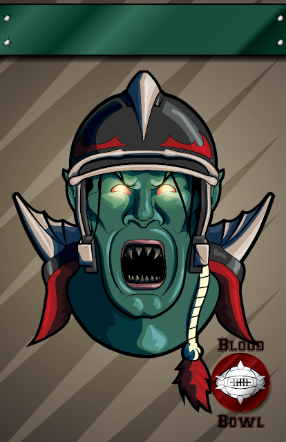
Coming back at you this week with a brand new poster for your Blood Bowl Team. You can download the pdf here, fill in your own team name, and print straight from Adobe Reader. Enjoy!
Showing posts with label Blood Bowl. Show all posts
Showing posts with label Blood Bowl. Show all posts
Friday, September 28, 2012

Friday, September 21, 2012
Customizable Blood Bowl Poster: Goblins!
Coming back at you this week with a brand new poster for your Blood Bowl Team. As always you can download the pdf here, fill in your own team name, and print straight from Adobe Reader. Enjoy!


Friday, September 14, 2012
Originality, Practice, and a new Chaos Poster
Most weeks when I sit down to start a new piece, I'm expecting an evolution of skill. From project to project, the difference in craftsmanship isn't very pronounced. While a better concept will ultimately result in a better execution, I "know" roughly how good a piece will look well before I've finished. It's one of the big barriers of extended practice, not being able to see yourself dramatically improve every time you do a new piece. Except for that every once in a while, something weird happens.

You can download the new poster here.
Those of you who have been following my work for a while will recognize instantly how much better this is than anything that has preceded it. This is one of those very rare moments, not of evolution, but revolution. This is a game changer, and inevitably will become the new standard by which all my other work will be judged.
So what gives? How did I make such a dramatic change in just 1 week?
You don't always have to be original
In a speech I listened to long ago, an industrial designer was trying to tell us something important. It would be several years before I finally understood his message. He said, quite simply, that most of the problems had been solved, and it wasn't my responsibility to try and re-solve them.
"Of course it is!" I thought. "If I'm going to be original, I can't build my work on someone else's ideas!"
Bullshit.
Einstein used an existing system (math) to address his questions of the universe. Picasso painted with materials made by other people, most likely in a mass manufactured setting. Beethoven composed music for the instruments that everyone else had been playing for hundreds of years prior. My point is that even with 95% of their work already done for them, it took the lifetime of massively dedicated individuals to reach the zenith of human achievement. Originality is important, but it must be tempered with moderation.
They already solved your problems
Enter the DC Comics Guide to Inking. I bought this book on a whim to get free shipping from Amazon. I rightly figured that someone who had been professionally working in illustration longer than I've been alive has a thing or two they could teach me. I got the book about a week ago, and read the first third of the book.
Wow.
I haven't even started in on the rest of it. The information contained in that book is so incredibly useful that I dare not go too fast for fear I'll miss something. But, in that first third, I learned enough about inking to revolutionize my technique. Every single thing I was doing wrong was covered in stunning detail. Not only did the book show me how it was wrong, but why. Most importantly though, it showed me how to fix it.
It was relieving in a way to realize that I'm not very unique and that I am running into the same mistakes as everyone else. Because if I make their mistakes, then I can make their victories as well. Needless to say, after seeing what this book could do for me. I went out and immediately ordered the other four in the series.
Practice
Time for the practice thing again.
It's not enough to just keep slamming your head against the wall for ten thousand hours and then call yourself the master. This needs to be very deliberate practice with the intent to improve. Ten thousand hours of drawing lousy pictures will only make you really good at drawing lousy pictures.
I just keep looking at that guy at the top of the post. I still don't believe I did that. But I will. In the meantime, it time to start the next poster sketch, and I can't wait to see what happens this time around...
Friday, September 7, 2012
Customizable Blood Bowl Poster: Wood Elves
Coming back at you this week with a brand new poster for your Blood Bowl Team. As always you can download the pdf here, fill in your own team name, and print straight from Adobe Reader. Enjoy!

Friday, August 31, 2012
Customizable Blood Bowl Poster: Dwarves
Coming back at you this week with a brand new poster for your Blood Bowl Team. As always you can download the pdf here, fill in your own team name, and print straight from Adobe Reader. Enjoy!

Friday, August 24, 2012
Customizable Blood Bowl Poster: High Elves

Coming back at you this week with a brand new poster for your Blood Bowl Team. As always you can download the pdf here, fill in your own team name, and print straight from Adobe Reader. Enjoy!
Friday, August 17, 2012
Customizable Blood Bowl Poster: Vampire Counts
You may notice something missing from today's Blood Bowl poster: the team name. That's because this week's offering is actually in the form of a fillable pdf that you can download, fill out, and print straight out of Adobe Reader!
In the coming weeks I'll be adding posters for some of the other races and archiving them in one location for people to find, download, and proudly display.
Friday, July 20, 2012
Bowling for Blood
I'm amazed at how many incredibly cool Blood Bowl teams there are out there. I got a request from Roy to make a poster for his team as well as the league they played in. Bring on the bowl!


Friday, July 6, 2012
Concept to Reality: Blood Bowl Poster
Collaboration is one of my favorite parts of art, and when I had a request from one of my readers to help execute an idea he had for a Blood Bowl team poster, I was all-in. Here's a play-by-play of how I took a scanned pen and ink drawing and re-rendered it in Adobe Illustrator.

Casey had sent me this drawing as a sketch of what he wanted to do with the design. Since this was my first time seeing the design, I made a couple notes of what I really liked about the design:
- The Crooked nose. This bad boy looked like it had been broken and reset a good dozen times. It screams character and attitude. Perfection.
- The Beard. Stylized to look almost like a set of blades, the facial hair looks just as crazy and dangerous as a Norse football player should be.
- The Wings. Naturally.
- Blood and Thunder. A fitting slogan for this band of ultra-violent miscreants.

I traced out the nose and beard, using the rest of the face as a guide. I actually went beyond the point where I knew the helmet would cover, as this would serve as a guide for when I placed the two together. By developing the head and face separate from the helmet, I didn't have anything to distract me and distort the image. I then gave the entire head a bit of a steeper tilt forward for that extra bit of aggression.

I took the basic design from an actual football helmet, changing details as I needed to make it more Blood Bowl-esque. In addition to the wings coming off the ear guards, I pulled the front line back to help expose more of the face, and added a reasonable number of rivets (read: not baneblade level of rivets).

Step 3: Blood and Thunder
I wanted to slogan to be more integral of the illustration itself, so rather than isolate the banner, I had it above and below the face. I took advantage of the two-dimensional effect to tuck the "and" a little further back, letting the eye rest on the "Thunder" at the bottom of the composition. Finally, I cut some small triangles out of the banner at random intervals to give the banner a little more worn feel.

Step 4: Variety
The current version of Adobe Illustrator has the ability to add variable stroke-widths to your line work. I use this option a lot to add contrast and interest while not overwhelming the smaller details. There are a number of width profiles that come standard that I use often, but I also created several profiles to reuse on my drawings. I also did a thicker solid line around the entire head to help it stand apart from the banner.

Step 5: Color
Not much to add here. Casey specified the color of the helmet should be the same as the Philadelphia Eagles. Done and done.

Step 6: Highlights
This two-step process was accomplished in just one. By tracing out the path I wanted the highlights to follow, I was able to duplicate the layer and set a thinner secondary highlight for extra depth. I made sure to highlight the areas that not only made sense but helped to reinforce the themes I mentioned earlier. The blade-edges of the beard, the curl of the sneering lips, the flow of the banners, they all strengthened the theme.

Step 7: Shadows and Posterizing
The shadows were a two-step process that couldn't be duplicated to save time, but were worth the effort regardless. The first layer was in the style of Anime cell-shading, using big blocks of slightly darker color. This gave a lot of much needed depth to the wings in particular.
The second shading was inspired by woodblock cutters like Rockwell Kent. By repeating the black lines in the darkest areas, I was able to not only add depth but to also suggest a flow of surface, something that would not otherwise be apparent in a perfectly flat color like you get from a vector illustration.
When I was happy with the illustration I dropped it onto a revised Blood Bowl poster template, where I shrank the Blood Bowl logo to give more breathing room to the main character.
And with that I was done; an incredible experience overall. I learned a ton on this project, about positioning, facial expressions, and perfection versus imperfection in a believable and living character. Many thanks go to Casey for sharing his vision, a true pleasure to work for.
Next week I'm getting some more model together for the rest of the clean slate challenge. Painted goodness inbound!
Sunday, June 24, 2012
Blood Bowl League Poster
Mercutioh stopped by last week and asked for a poster for his local Blood Bowl League. I couldn't think of any reason not to, so here it is!

I'm loving the Blood Bowl Stuff.
Friday, June 15, 2012
Blood Bowl Posters: Part 2
Upon seeing the first round of Blood Bowl team posters, Tristan sent me some pics of his teams, all of which were equally inspired. I think we're going to need a poster gallery on the site soon!
Bring the Blood Bowl!


I'm loving making images for members of the community. Thank you every for sharing your great ideas and inspiration.
Friday, June 8, 2012
James Draw: Blood Bowl Posters
After I had posted last week's Tau Propaganda poster, I got a really cool request from Paul (of the Man Cave).
He and his son have been building different Blood Bowl teams for a little while now and he thought it would be a good idea for me to turn my drawing sights on some team posters... I agreed.
The only problem I had when looking at all the teams he and his son and made was trying to figure out which was cool enough to warrant a poster design. Since they were all awesome, I did the only logical thing and made posters for all of them.
Bring on the Blood Bowl!


Many thanks to Paul for sharing his inspiring work.
Subscribe to:
Posts (Atom)