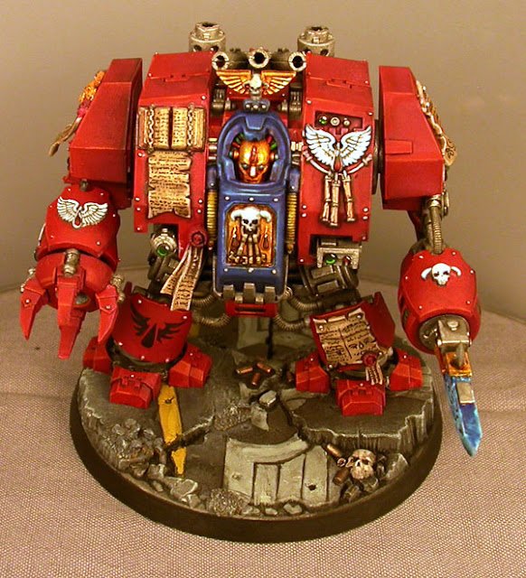
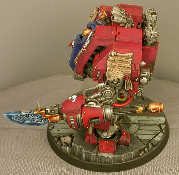
Needless to say, after seeing so many terminators, I was more than ready for a change of pace!
Faith is Eternal
Compared to the seemingly endless undertaking of multiple nights and weekends to finish the last project, the dreadnought was a trifle. It took less than 2 days to go from grey plastic to gluing the last pieces in place.Being able to work on every piece individually is a huge boost. I knew the project would be simplified by the straightforward painting angles, but I hadn't considered the mental side of the equation. Having 4 completed pieces after just an hour of work makes it very clear for you to see your progress; it's viscerally satisfying to watch the pile of painted bits grow.
However, I realized on final assembly that I had missed several angles that I assumed would have been covered up by the assembly. I understand much better now that I've completed a "new" style dreadnought (Furioso/Ironclad/Venerable) which panels need to be painted, especially in terms of the exhaust and the main body. This will come in handy when I start work on the Ironclad Dreadnought for my Howling Griffons.
Proper basing
As it stands, the standard dreadnought base is way overused. It's hard to mix things up, especially if you have multiple dreadnoughts in a single force. You basically get two models worth of poses out of this base before you start repeating yourself. Thankfully, with such large flat surfaces, you have an excellent 'canvas' to work with for some easy customized bases.The beauty of this base are the large cracks that separate the different planes. They let you screw up and no one will ever notice.
Consider the base I just completed.
Looks nice right?
Would you believe me if I said it was a disaster?
I drew the wings way too big for the body of the eagle, leaving not nearly enough space for the heads to fit. The tail feathers are ridiculously out of proportion with the wings, and the body is just proportioned wrong.
But you don't see that, because everything is all busted up.
It's been shown that your eye will 'fill in' information that is missing, which is the basis for an endless variety of optical illusions. In this case, the illusion is that you're looking at a well proportioned piece of illustration that was then broken up and scattered. But if you were to reassemble the pieces, you'd find a rather unfortunate bird. Poor thing would look like a mutant. That's why this base is so brilliant, it gives you a solid surface to mount your model to, and plenty of forgiveness for your forays into freehand design.
Highlighting Red
Red is a pain to highlight. If you look at the cold end of the spectrum, blues and green highlight no problem while sticking within the color itself. But when you highlight red, I've found the only way to really push the shadows and highlights is to branch into secondary colors. In this case brown for the shadows and orange for the highlights.There are basically two major schools of thought when it comes to highlighting; saturation vs. luminosity. Basically, you can choose to have the color become more intense as it gets 'brighter' or move it closer towards pure white. While the saturation method isn't realistic, it's very pleasing to the eye, similar to the traditional comic-book style. It's my preferred method of highlighting, as it gives the models a more intense color which really helps them stand out on the tabletop.
The trick to a good highlight is to keep your lines clean and subtle. It's supposed to be the absolute peak of color, and you don't want it dominating the base color. Too much orange quickly turns the model orange instead of red. My preferred method of highlighting is to take a flat brush, get some paint on the tip, and actually start painting with the base of the brush where I haven't gotten any paint at all. With each successive stroke, I move the brush a little closer to the tip with the paint. This draws out a very small amount of pigment, giving you a high degree of control over how bold your highlights are.
The Perfect Parchment
I've never been entirely happy with the way my purity seals and parchment came out, until now. I bought my first bottle of Dheneb Stone last weekend and I immediately kicked myself for not having done so before.If you're painting parchment, you need Dheneb Stone and Devlan Mud.
After using it the first time, I was convinced there just isn't any other way to paint parchment. Here's what I have worked out so far:
1. Base coat of Dheneb Stone
2. Any freehand design you want to do
3. Make sure it's completely dry!
4. Wash the whole thing in Devlan Mud
5. While still wet, use a clean brush to lift away the wash from areas that you want lighter
The result is a smooth shadow that really conveys the texture of paper. By freehanding first, you are able to easily correct your mistakes with a flat coat of foundation color, and the wash will help integrate the color into the shadows, adding another level of depth.


