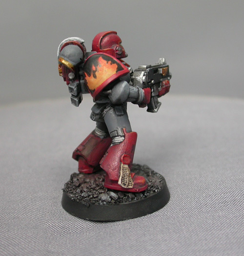
After developing a cool homebrew marine chapter, one of my readers surprised me by asking that I take his vision into reality. His request was that I read the fluff and look over the color schemes he had generated. Based on this information, I would produce a marine that would serve as a template for the rest of his army. This was entirely too cool of a proposition to pass up. After reading all the obvious care and dedication that went into the Sons of Hephastus, I knew I had to do this project.
Colored Primer
Normally I'm not a huge fan of colored primer, but in this case I was okay using a grey primer to get things started. Black, white, and grey primer are all good colors to keep handy, as they come use in a variety of situations. As the other major colors of the scheme were red and black, I wasn't afraid of losing the vibrant saturation of the paint color, often a pitfall of starting with grey. Black is all but impossible to mess up, and red is a powerful color that doesn't fade easily, or at all.
After starting with grey primer, I used foundation grey to create the base coat of the armor. By applying two successive layers of roughly the same hue, I had a perfectly smooth finish after a single coat of paint. Even with the advent of foundation colors, this is rare.
The only reason I'm not a huge fan of colored primer is that if you plan on painting a whole army, you are forevermore anchored to that primer. If the color goes out of print, or your favorite hobby store stops stocking the color you need, you have to resort to the internet and pray that whoever is running the store on the other end of the world isn't asking for too much money.
In almost every case, I highly recommend white primer. It coats clean, smells less than black primer, and forces you to be a better painter by not covering up your mistakes like black and grey do. I used white primer on this model for the should pads only, but that made a huge difference with what I was about to undertake.
Bright vs. Dark (extreme contrast)
The color scheme called for flames to be painted against a black background. Rather than try to paint over black, I elected to start with the colors I needed for the flame and go from there. With a blank space, I was free to be as messy as I wanted, which livened the colors up considerably.
Once I had the gradient the way I wanted, I painted in the edges of the fire, blocking out the area that would remain colored. It was a much simpler and cleaner job to block out the black areas. This method allowed me to finish the shoulderpad in a very short amount of time with a high degree of precision.
This technique was ideal for the white anvil on his other shoulderpad. As hard as it is to paint yellow on black, it's ten timers harder to paint white.
Color Palette Limitations
Normally I highlight my black armor in tones of blue, but with this color scheme, it seemed another color would confuse more than define. I elected to keep the highlights grey to match the rest of the model and limit the color palette to four basic colors (Black, Grey, Red, Yellow/Gold)
Once you get past the third of fourth color, things can get ugly, if not gaudy. Yes, if you plan on doing a Harlequin troupe, add colors to your heart's content. But if you're looking to push a strong visual color theme, keep it simple. Less colors means easier recognition and less time spent painting, not a bad deal.
Overall, it was a great experience. Sharing in someone else's inspiration is a wonderful thing, and it tells me this site is heading in the right direction. I look forward to seeing what models this single marine inspires in the future.


